See The Emotional Toll Of The Pay Gap In This Gorgeous Visualization
by Katharine Schwab
The pay gap is real and persistent. One way to begin the process of eliminating the disparities between how men and women and white and nonwhite people are paid is to collect data–something that the U.K. recently mandated for all companies with more than 250 employees. Once there’s data, and companies recognize that they have a problem, they can take active steps to pay women and people of color more.
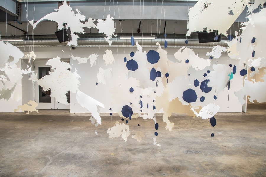
But understanding the emotional toll the pay gap takes on women doesn’t just require science: It needs art as well. Using data about the pay gap in the tech industry from the recruiting startup Hired, a new installation at the Minnesota Street Project art space in San Francisco tackles the pay gap using a swirling cloud of abstract shapes. It was created by the Bay Area-based artist Val Britton, who was formerly Facebook’s artist-in-residence, and it includes a 3D installation that takes up the entire space, and two 2D collages on the walls.
When Hired first approached Britton and curator Wendi Norris about the project, Britton says her first reaction was that she wasn’t going to produce a data visualization that would just explain the data. “It’s not going to be a pie chart, it’s going to be information blown through a tornado,” she says.
“Tornado” is an apt way to describe the installation, called The Shape of Change. Abstract forms cut out of light-colored paper are suspended from the ceiling with string, creating a floating mass of jagged, complicated shapes punctuated with darker blue angular dots. The work was inspired by the significant number of women who make less than they should be: in Hired’s report, 54% of women had learned they were making less than a male peer in the same job. “I wanted the installation to represent the gap between quantities,” Britton says. “What does it mean to take information and give it physical form, and you can walk around and under, and you can feel your body in relation to this quantity of material?”
While the cloud-like shape of the installation at first glance makes it look like a light, happy piece, there’s something darker when you look closer. The abstract shapes in some ways represent just how difficult the pay gap problem is to comprehend, even when there’s data and statistics–it just doesn’t make sense that women are paid so much less than men in so many sectors, given that more women graduate college than men. Britton’s explanation of her own experience dealing with inequality in the art world illuminates its complexity.”I’m a woman in the art world, taking up space; my artworks are big and take up space and they want to be seen,” she says. “I want to bring attention to these issues. I don’t think [the work is] explaining everything, but it’s opening up the conversation. Why is it that women get less and what are we doing about it?”
And unlike a data visualization–which is just as important in understanding the pay gap problem and advocating for justice–the art is able to tackle the challenges of inequity from a more emotional perspective. “It’s not some computer-generated thing that gives you the info from A to B to C,” Britton says, referencing her art. “It’s thornier than that.”
The exhibition also includes two two-dimensional works that hang on the walls of the room near the cloud. While Britton similarly took specifics from the report and used them to create abstraction, these are both more literal. One painting is constellation of pink geometric shapes and swirling smoke, where the pink shapes represent the 37% of women surveyed who are making equal to or more than men. The rest of the painting’s smoky background points to the 63% of men offered greater compensation than women for the same job at the same company. The image, called Weights and Measures #1, is speckled with white masses, which stand for the 6% of women who ask for equal pay. In Weights and Measures #2, streaks of pink represent the 11% likelihood that female candidates are underrepresented during the hiring process.
Britton hopes that the work starts a conversation about the impact of the pay gap and provides a creative space where people can start to think about solutions. “It’s not explaining the information and laying it out to you,” she says. “I don’t have the answer. But through my artwork I’m asking questions.”